By
By
Let’s think together about an ad you will create. You identified your target audience and worked on the visuals to be appealing, a grabbing ad copy with product benefits, and a clear CTA.
There is nothing left for customers but to click on such an ad. The question is, what is the page they should be directed to?
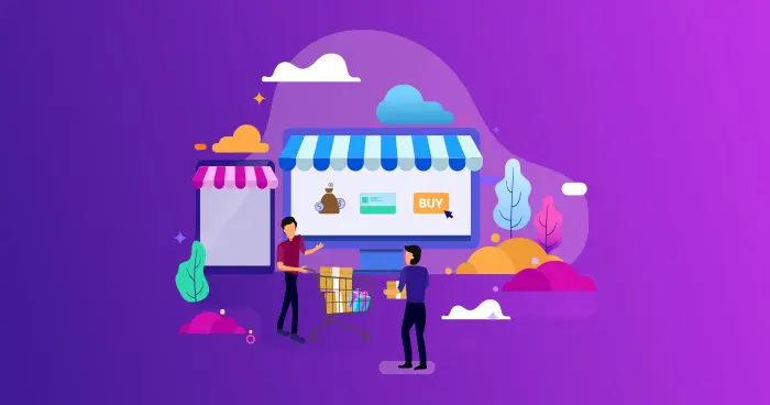
We have the answer: it’s the landing page.
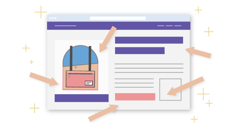
An e-commerce landing page is a website designed for mainly one goal which is convincing visitors to convert. Hence, its key element is including a clear CTA to assist in the conversion.
Some businesses have a misconception that when users click on an ad, they should be directed to a product page to achieve desirable results. Well, like we said, it’s a misconception.
Several studies have tackled such a matter and proved that product pages underperform when used as landing pages. For instance, Monetate mentioned that product pages serving as landing pages lead to high bounce rates and lower customer engagement.
In addition, the conversion rate of product pages is 7.91% compared to 26% of landing pages (Inkyy,2023).
All signs are showing the importance of landing pages for your e-commerce. So, never miss a chance with our full guide on the best e-commerce landing page examples with the best practices to follow.
E-commerce Landing Page Examples + Best Practices
- Boxy Charm
- Infinite Moon
- MeowBox
- WaterDrop
- Savile Row Company
- Farmers’ Dog
- Casper
- Fabletics
- Watch Gang
- TYME
- TKEES
- ALALA
- Pandora
- Beardbrand
- Charlie’s Rawsome Granola
- Abbott
- CPJ
- Solo Stove
- Hello Fresh
- Dollar Shave Club
Get ready and prepare yourself to take notes for the best e-commerce landing page examples for inspiration. In addition, we will shed light on the best practices so you can maximize your benefits.
1- Boxy Charm
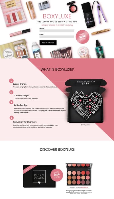
From the visuals to the winning lead generation tactics, Boxy Charm grabbed our attention with the quality of its landing page.
It was able to create a buzz around its new subscription box feature by igniting shoppers' curiosity. It created a promotional landing page that explains everything about its new feature, which is still not launched yet. However, it encourages interested users to convert by entering their emails and being the first to know about it.
At the time of launching, Boxy Charm will have a huge list of already interested users in its subscription box.
By focusing more on the brand’s landing page, you will be astonished by the details. The behind-the-scenes video attached at the end makes shoppers more involved in the process and increases customer engagement.
Most importantly, Boxy Charm doesn't only highlight product features but also the benefits of the products. This resonates more with customers and makes them more inclined to convert.
Therefore, always tailor your landing page to be benefit-oriented.
2- Infinite Moon
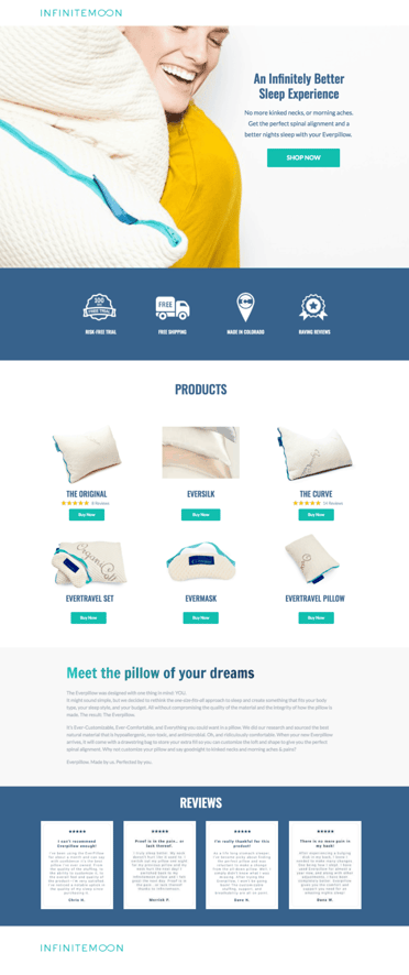
What else can be better than a comfortable and long night's sleep? With a good night's sleep, you'll spread sunshine and rainbows wherever you go. As it enhances your mood, creativity, productivity, and body health.
But you know what you need for such a good night's sleep: a fluffy and comfortable pillow. Once you land on the Infinite Mood landing page, you are so ready for” an infinitely better sleep experience”, as they said.
Infinite Mood goes on our list of the best e-commerce landing page examples. Its visuals grab the attention of anyone who appreciates good sleep.
Above all are the reviews and testimonials included on its landing page. It contributes massively to increasing conversion rates due to several aspects. Customers’ reviews build brand trust and credibility. In addition, it highlights social proof, which proves that people are most likely to convert as a way of imitating others.
So, whenever there is a chance, make sure to include reviews and testimonials on your landing page to motivate shoppers to place an order.
3- MeowBox
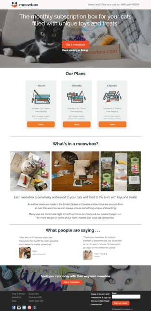
Cat owners, let’s gather up here as we have something interesting to show you.
Now, look at this landing page by MeowBox; we have to say there is nothing a picture of a cat can’t fix, and we guarantee that several cat pictures will ensure high conversion rates.
Because they understand the hassle for all cat owners, MeowBox created a monthly subscription box that includes unique toys and treats. It highlights the available plans on its landing page to suit different customers' preferences.
But our favorite part is the cat testimonials! (BRB, kitten pictures are melting our hearts). Besides the cat images, such reviews and testimonials build more brand trust and credibility, which contributes to achieving the goals of a good landing page.
MeowBox didn’t stop at this point; it worked on generating leads by gathering visitors' emails to subscribe to a “kittens-filled newsletter”.
Seriously, what else do we want?
The best practices to follow from this landing page are to include testimonials, reviews, and as many cat pictures.
4- WaterDrop
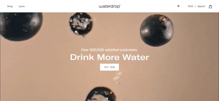
A unique product needs a unique landing page. That’s why WaterDrop is on our list of the top e-commerce landing page examples.
WaterDrop provides customers, specifically those interested in fitness, with flavored capsules to be added to water to motivate them to keep on drinking water. Accordingly, it created a minimalistic landing page with suitable light colors.
So, visuals, check.
In addition, it showed the number of satisfied customers to build credibility and highlight social proof. Most importantly, it showcased a clear CTA to encourage users to place an order promptly.
Social proof, CTA, check.
5- Savile Row Company
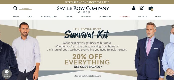
One of the key practices to use for your landing page is highlighting an offer. Because how don’t like some dollars off?
Savile Row Company followed such a path and showcased its offer on its landing page as a kind of motivation to place an order. In addition, it used visuals for the different products it offers.
The business sells finely trimmed suits and shirts for men. Hence, its images express its premium products accurately.
6- Farmers' Dog
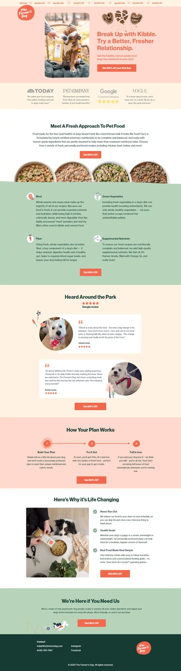
Hands down to one of the best e-commerce landing page examples.
We couldn't stop ourselves from staring at the Farmers’ Dog landing page. We are so convinced that we are about to place an order. This manifests a high-converting landing page for e-commerce.
Anything that includes dogs, we are so in. Apparently, farmers’ dogs understand this very well, and that’s why their landing page is full of dog images.
And since dog owners always want the best for their little fur besties, Farmers’ Dog offers healthy, high-quality dog food delivered to their doorstep.
Also, it focuses on building brand trust and credibility. Hence, it highlights badges from credible sources like Google reviews. In addition, it includes reviews and testimonials from dog mums mentioning the benefits of Farmers’ dogs.
Farmers’ Dog showcases brand features and benefits as well. It highlights the ingredients of its products; in addition to the benefits accompanied with having it. For example, dog owners will never run out of food, will ensure their dogs' health, and come with instructions on the right portions.
Not to mention the 60% discount, which is vivid for all visitors, and the clear CTA that can’t be missed.
7- Casper
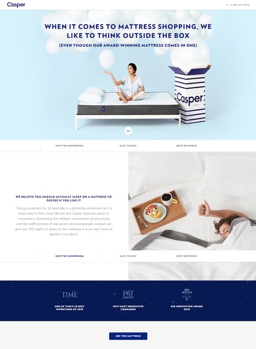
Once we say “ an award-winning mattress”, this reflects more credibility and trust in such a brand.
Therefore, Casper constantly highlights such an aspect in its landing pages to gain customer trust. However, what we loved even more about Casper’s landing page is that it addresses the doubts customers face whenever they are about to shop online.
Accordingly, Casper provides customers with a 100-night at-home trial for its mattresses to make sure they like them. Thus, if customers are skeptical about shopping online for mattresses before trying them, Casper gets over this issue while highlighting it on its landing page.
This is one of the best e-commerce landing page examples as it inspires other businesses by including the elements that assist in removing any customer doubts before placing an order.
Thus, a key practice, put yourself in the customer’s shoes and think about what would make shoppers inclined to convert through your landing page.
8- Fabletics
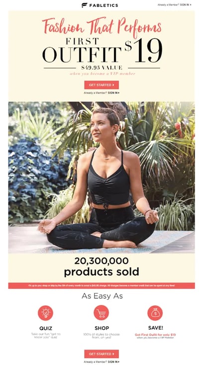
One reason that put Fabletics on our list of the top e-commerce landing page examples is that it includes everything!
It starts with a huge offer that can’t be missed, and it’s a limited-time one too. Hence, it utilizes urgency, one of the crucial aspects of FOMO marketing that encourages shoppers to place an order.
Then, it highlights the number of products sold to manifest social proof. Since customers constantly seek others' confirmation, this counter encourages visitors to place an order.
The page’s clear CTA and steps to follow ensure that customers follow a certain path to convert. Finally, the visuals, the appealing colors, and the image of the model wearing Fabletics all contribute to a highly converting landing page.
9- Watch Gang
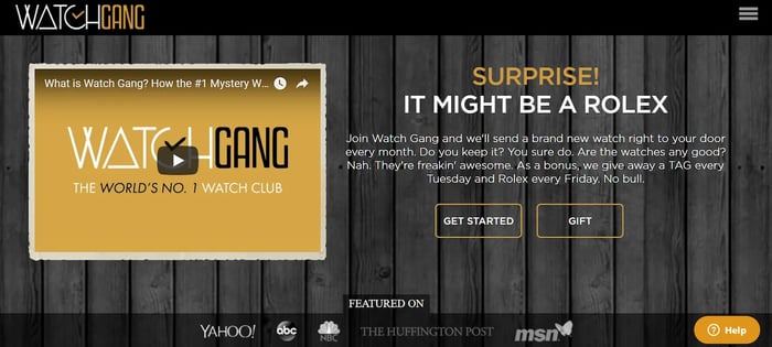
You know what they say, an image speaks a thousand words, well a video speaks a million words.
This is our belief, we made it up but we believe it’s correct. Watch Gang agrees with us too.
On its landing page, Watch Gang uses a video to explain its products, and what it has to offer, This resonates more with customers than images.
We can’t miss talking about its attention-grabbing headline as seriously who doesn’t want a Rolex?! If this does not grab your attention, we don’t know what will.
The “featured on” section delivers brand credibility and trust especially since it shows well-known sources like Yahoo and ABC.
The key takeaway from this e-commerce landing page example is to incorporate videos whenever possible. Their results can go a long way and assist in high conversion rates.
10- TYME
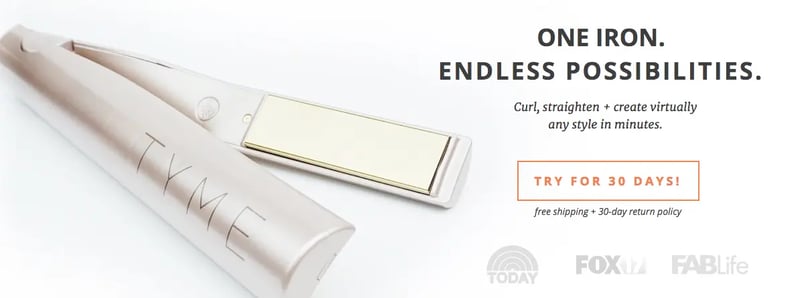
We are so in love with this one created by Tyme. The visuals are very appealing, an image that shows product details, a direct headline, a clear CTA, and credible sources for a feature.
However, what we liked the most about this landing page was its call to action. The brand tried different calls to action until settling on this one “Try for 30 days”. It leads to higher conversion rates by 18% compared to “Learn more”.
It has been proven that the “try for 30 days” motivates users to place an order as they realize that they have a chance to try the product and return it if they don’t like it.
11- TKEES
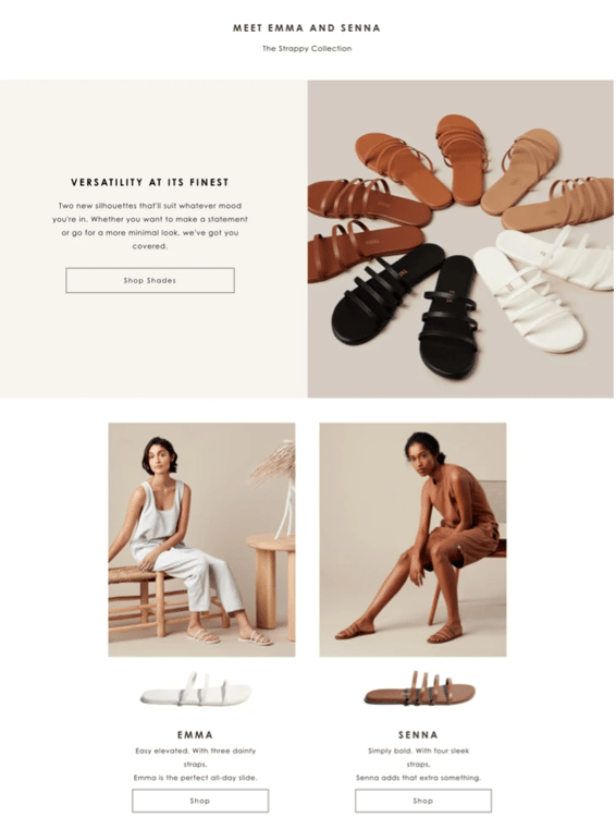
We love the simplicity of the aesthetics used by Tkees in its landing page. They rely on this landing page to grab visitors interested in its new sandals collection. Hence, its minimalist design ensures that customers don’t miss placing an order.
In addition, it has a clear and direct CTA. Thus, it’s evident that Tkees focuses mainly on creating a highly converting landing page.
12- ALALA
Any visitor to this landing page will feel nothing but confidence. The powerful image and headline serve as prominent indicators.
The brand didn’t stop at one or two images for its products; instead, it created a gallery of matching sets in which users can choose the most suitable one. In addition, the images were arranged by colors to deliver a more visually appealing experience.
The landing page may appear simple, but its significance lies in its ability to deliver a compelling and user-friendly experience.
13- Pandora
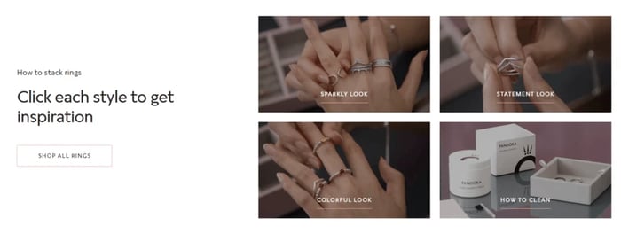
On this landing page, Pandora provides visitors with a variety of options and different product categories to preview. This ensures that at least one category will resonate with users and encourage further exploration.
In addition, it previews tutorial videos on how to use and maintain Pandora products. Most importantly, the clear CTA so shoppers won’t get lost from the landing page's main objective.
Accordingly, one of the key practices is to stay direct and to the point. Sometimes, this is all that your landing page needs.
14- Beardbrand
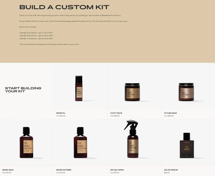
Beardbrand takes any visitor through a full experience in which they are left with nothing but placing an order.
They start with an attention-grabbing headline that nobody can miss. It’s so descriptive that users can even imagine the fragrances. By scrolling through the landing page, visitors will have the chance to personalize their fragrances, ensuring no leads are missed.
Finally, Beardbrand concludes its landing page by mentioning the return and exchange policy along with guarantees to address any concerns shoppers may have. Hence, encouraging them to place an order without any doubts or hesitation.
15- Charlie’s Rawsome Granola
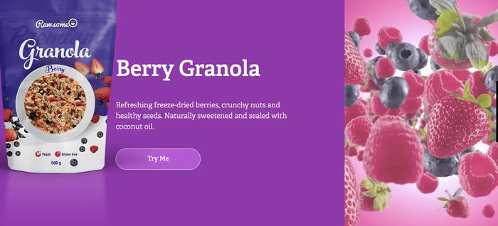
We are impressed with this e-commerce landing page example provided by Charlie’s Rawsome Granola.
The quality of the visuals and the colors used can never be missed. Even if you are not into Granola, the images will make you interested to try it.
As you go through its landing page, you will find the benefits and the uses of the Rawsome Granola. This is complimented with the “ Try me” call to action ( which we are about to do now).
One of the key takeaways is to focus on the colors and visuals used as they are an integral part of customers' experience through your landing page.
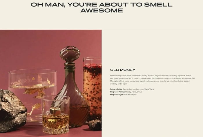
16- Abbott
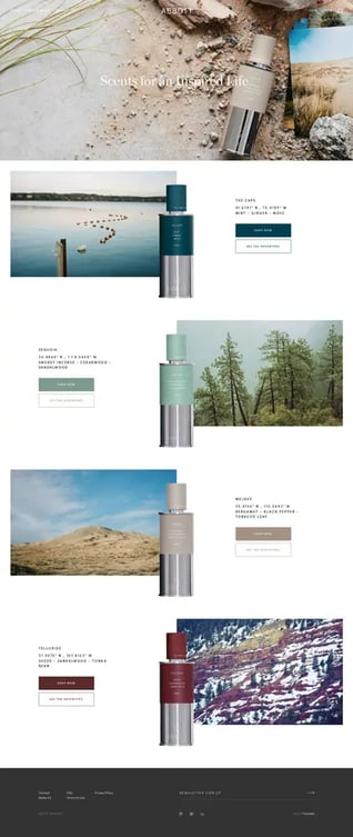
Abbott is a fragrance maker that relies on its landing page to promote its environment-inspired scents.
We will start by shedding light on the catchy images expressing the geo-inspired scents. In addition, they are very expressive and descriptive to the extent that you can smell the fragrance. The minimalist design with a clear CTA undoubtedly encourages users to convert.
17- CPJ
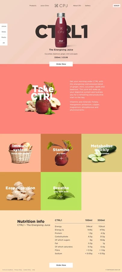
The different dimensions of the CPJ landing page show how they pay attention to every detail to achieve the desired objectives.
Their choice of colors and visuals deliver a pleasant customer experience. In addition, it tackles all the details of its energizing juice product while highlighting the benefits associated with purchasing it.
Finally, the brand understands its target audience and how they are health conscious. Accordingly, it shows the different nutrition details to address customer concerns.
Consequently, a key practice you should always utilize is to define your target audience before designing your landing page. This ensures higher relevancy and tackles customers’ pain points.
18- SoloStove
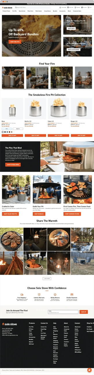
To advertise the sale of outdoor cooking supplies, SoloStove uses a vivid and energizing color scheme of orange and black. This delivers a powerful visual tone and is one of the best examples of an e-commerce landing page.
Visitors are directed to an inner page presenting various products with their prices and descriptions by a CTA that appears promptly. What we loved about this example is the “ share your warmth” section, which shows customers pictures using SoloStove. Hence, resonating more with visitors and building brand trust.
19- Hello Fresh
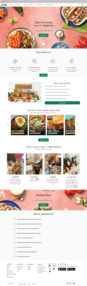
Hello Fresh is a food delivery service that provides fresh ingredients and recipes to customers' doors. They emphasize quick-cooking dishes and wholesome, delicious cuisine.
Its headline perfectly expresses the brand as “it takes the stress out of its mealtime”. Accordingly, it provides customers with hassle-free meal prep.
It takes users through a full guide on its products, their benefits, the components of its boxes, and different categories for its meals to suit all preferences.
To enhance customer engagement, it allocated a complete section on its landing page directed to customers’ images enjoying Hello Fresh products.
We can say that Hello Fresh nailed it in creating an ideal landing page that for sure increases conversion rates.
20- Dollar Shave Club
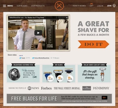
Dollar Shave Club is an online retail store providing customers with razors and other trimming items. They provide stand-alone items and a subscription membership program in which consumers are periodically billed and supplied products.
Dollar Shave Club was certainly on our list of e-commerce landing page examples. In fact, it was regarded as the landing page that took the razor world by storm!
Well, we are here to see if this is true or an exaggeration.
First, it started with a video which we have to say that we admire. Videos are highly influential when placing them on landing pages.
Second, the attention-grabbing headlines and images. You need nothing but to “do it” just like Dollar Shave Club is saying.
Third, the testimonials section and features all contribute to building brand trust and credibility.
Finally, who can resist receiving free razors for life? If that doesn’t make shoppers convert, we don’t know what else will.
Dollar Shave Club, you rock!
Final Thoughts
By examining 20 e-commerce landing page examples, it became evident how a well-crafted landing page massively contributes to the success of your online business.
It has been shown that there are vital aspects that need to be included like a clear CTA, appealing visuals, and product description. An effective landing page assists in achieving a primary goal which is high conversion. Hence, including these elements will ensure attaining the desired objectives.
Speaking of conversion, Convertedin is a marketing automation tool that plays a crucial role in making customers convert.
It offers various services like auto-segmentation, personalized product recommendations, email marketing, and ad automation. They all serve to boost your e-commerce sales while ensuring high conversion rates.
Not sure where to start? No worries; we are here to guide you.
Book your demo now with Convertedin to discover the potential of your online store.