Top 9 Ecommerce Facebook Carousel Ad Examples To Inspire Your Next Campaign
Facebook emerged as a social media platform that connects people but nowadays it’s much more than that! There is little to no successful eCommerce business that doesn’t use Facebook in their marketing efforts. The platform presents a perfect opportunity for businesses to connect with their customers and increase their sales.
As an eCommerce business, you are probably already using Facebook in your marketing but are you using carousel ads? If not, then you are missing out on some major returns!
Whether you are already using carousel ads or planning on using them in the future, keep reading to learn more about the ad format and find the top carousel ad examples to inspire your own!
What are Carousel Ads on Facebook?
A Facebook carousel ad is a format that allows you to post from 2 to 10 images or videos in one ad. This ad type works great for all devices, and it is also worth noting that each card can have its own description.
For eCommerce, Facebook carousel ads can be used for multiple reasons, such as:
- Telling your brand’s story
- Giving a tutorial on how to use your products
- Showcasing your top sellers
- Highlighting reviews and user-generated content
- Zeroing in on a specific product with all its features
- Retargeting old customers (using dynamic carousel ads that show each customer personalized recommendations)
- Listing benefits of one or more products
Discover more about How To Create Successful Facebook Carousel Ads for eCommerce
Top 9 Facebook Carousel Ad Examples To Inspire Your Next Campaign
Carousel ads were first introduced to Facebook back in 2014. That means there are thousands of carousel ad examples out there! However, not all of them are winners, so we did the leg work for you and found the top 9 Facebook carousel ad examples for eCommerce. These examples will help get you that spark of innovation you need to kick off your own campaigns!
1- Earth Shoes

We have to start our list of Facebook carousel ad examples for eCommerce with the Earth Shoes spectacular ad. This ad focuses on the company and its customers' main goal of working on/buying an environmentally-friendly product - which is helping the environment.
Earth Shoes even took it a step further and put a bigger aim to attract customers (help people in Haiti). This makes the ad appeal to the emotional side of the consumer, and that’s always a huge plus for eCommerce businesses, as they are not really known for their kind hearts (no offense).
2- BarkBox
As an eCommerce business that provides dog toys and treats, BarkBox tapped into the company’s love for their dogs and created what can only be described as an awe-inspiring carousel ad.
The ad has a one-of-a-kind design that will stop anyone who stumbles on it to understand what is it promoting. Additionally, each card highlights one of the company’s unique selling points (like the free shipping with all the plans).
3- Shein
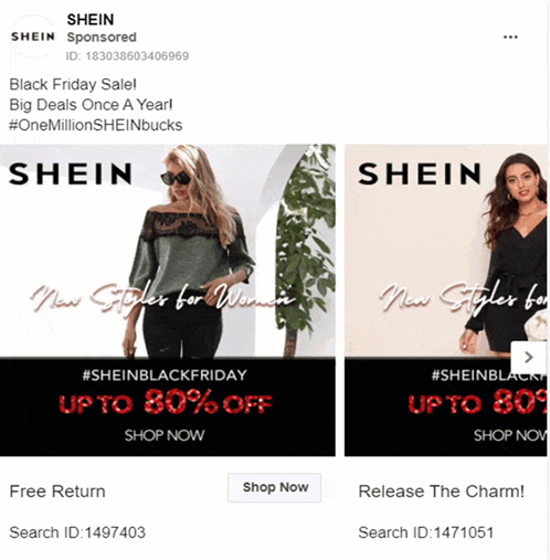
The eCommerce titan, Shein, has some of the best carousel ad examples out there! In this particular example, it is promoting its Black Friday offers and deals. Notice how each card has the product’s ID and a strong call to action (shop now). This helps customers easily return back to the products they want if they don’t make an order instantly.
Using carousel ads to showcase your promotions is a great way to get the word out there and show that several products are available in the promotion.
4- Square
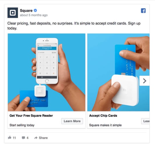
One of the best simple yet effective carousel ad examples is the one created by the mobile payment company, Square. In this ad, Square provides a how-to type of content that clearly explains how you can use their services.
The how-to carousel ad is perfect for businesses that offer services and complicated products (like technologically advanced products or products introducing new concepts).
5- Feather
Another great one of the how-to carousel ad examples was created by the furniture renting company Feather. If you are wondering what furniture renting is, don’t worry you are not alone!
Since it is operating with a novel concept, the company focused the ad on showing how it works. It starts with a question and gives a part of the answer on each card, only finishing the whole answer by the last card.
6- Shutterfly
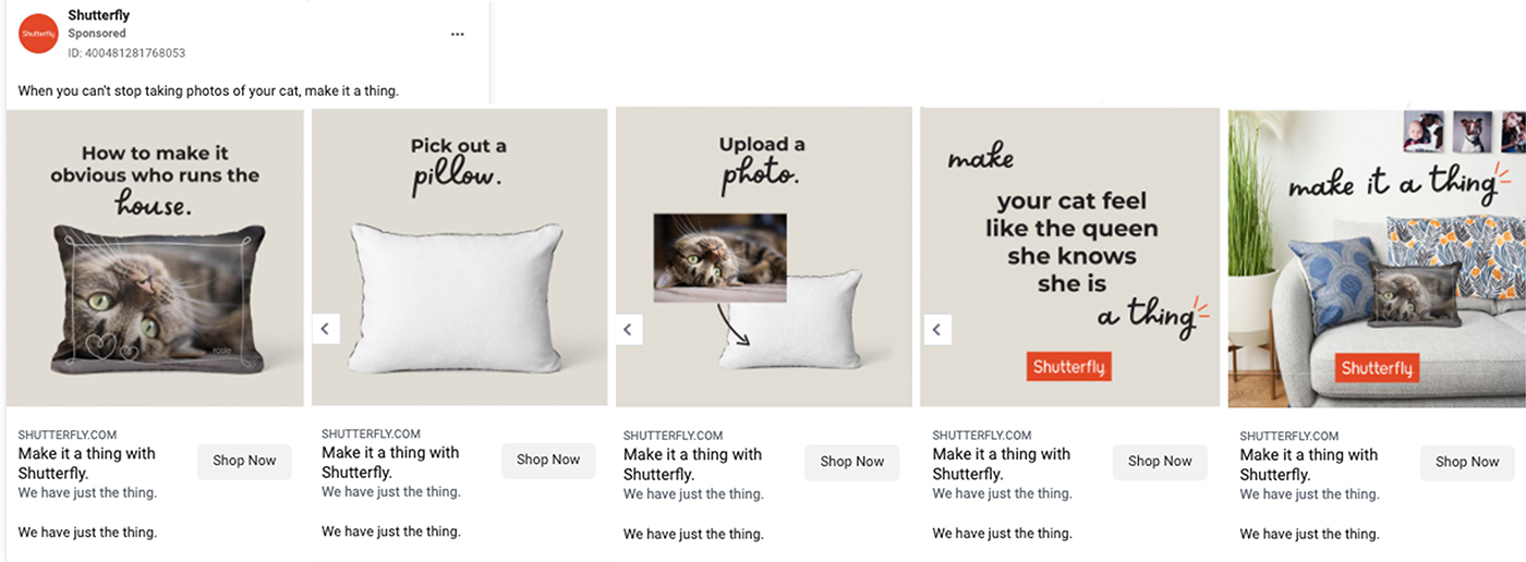
How-to carousel ad examples can be a lot more than purely informational (with a CTA). For instance, the Shutterfly ad combines the process of making an order through the website and also taps in on an emotional aspect by using an example of your pet.
This is a scroll-stopping technique. Who wouldn’t stop to take a look at this cute ad? Now that you get the attention, you start highlighting your products’ features and value proposition.
7- Ralph Christian Watches
Ralph Christan Watches sells luxurious watches at an affordable price; this can be considered a niche market, especially as it only targets men. In this carousel ad, Ralph Christan Watches is prompting several products with high-quality visuals that grab attention.
It is also worth noting that the caption of the ad starts with a great review from one of their “verified” customers. This adds a sense of credibility to their ad and combines both the advantages of organic and paid content.
8- Alienware
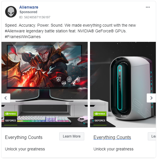
Alienware Facebook carousel ad has an incomplete image, which entices viewers to scroll and see the whole ad till the very last card. The continuity concept is great for introducing new products or ads aiming to increase engagement.
As an eCommerce business, this type of carousel ad is not only optimal for new products but can also be used for announcing promotions and listing a product’s features.
9- Circular & Co
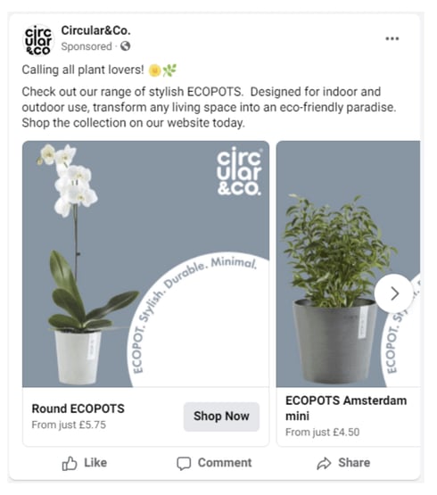
In the Circular & Co carousel ad, the main focus is the products; accordingly, the ad has a very simple and straightforward design. This ensures that the viewer’s full attention is on the products themselves, not the design or any other factor in the ad.
The ad even has the same colors on all cards, so no one can lose focus of the main idea (highlighting the products). Additionally, Circular & Co added the price of each product to the related card.
This could be a double-edged sword, as it ensures people who click will actually make an order. In other words, you will eliminate clicks that won’t convert. So if your aim is increasing conversion then that’s a great tactic; however, if you are looking for website visits or clicks this is not the way to go.
Bottom Line
Now that you read all about the top carousel ad examples and why they were successful, it’s time for you to start creating scroll-stopping carousel ads! Marketing operating systems like ConvertedIn can help you in creating Facebook (and Instagram) dynamic ads that convert!
Book your demo now and create the next top eCommerce carousel ad!
 By
By


