Boosting your eCommerce online store can be a real challenge!
Think of this: what are the online stores that you love to shop on? Is it messy, disorganized, and overwhelming for you? Or a place where what they have to offer is crystal clear, attractive, and clean?
Landing pages come into play here.
E-commerce landing pages serve as online stores. The beginning of the visitor's purchase experience is initiated by this, which also keeps them on your website.
E-commerce landing pages were developed with the intention of converting potential buyers and including text that is simple and succinct so the value proposition is understandable. The best landing pages can act as a catalyst to increase lead generation, conversion rates, and marketing campaign effectiveness.
Optimization of eCommerce landing pages is essential to the success of online businesses. In order to enhance a landing page's performance and boost conversions, modifications must be made to both the design and the content. Businesses should adhere to a number of recommended practices in order to optimize their eCommerce landing pages.
This article will define e-commerce landing pages, provide examples, and the best practices for your website.
Table of Content:
- What is an eCommerce Landing Page Optimization?
- The Best 10 Practices for Optimizing Your eCommerce Landing Page
- Use a clear, compelling headline
- Have clear objectives and goals
- Optimize your layout, design, and images
- Use clear, personalized calls-to-action
- Have a responsive design!
- Use Social Proof
- Make sure there is no loading time on your landing page
- Establish a sense of urgency to heighten FOMO
- Optimize your landing page forms
- Use analytics!
What is an eCommerce Landing Page Optimization?
eCommerce landing page optimization is the act of enhancing a particular page on an eCommerce website so that it is more effective at turning visitors into customers. When someone visits your website for the first time, they land on the landing page. This is your chance to make a strong first impression and persuade the visitor to take action.
The main objective of eCommerce landing page optimization is to raise the conversion rate of the page, which is the proportion of site visitors who complete a certain activity, such as completing a purchase, filling out a form, or signing up for a newsletter. eCommerce landing page optimization uses a number of strategies to do this. In this article, we will get to know the strategies and best practices for the ultimate optimization.
The Best 10 Practices for Optimizing Your eCommerce Landing Page
Some of the greatest techniques for optimizing your eCommerce landing page are listed below:
1- Use a clear, compelling headline
Make sure your headline expresses the value of your product or service simply and succinctly. Because they are the first thing a potential consumer sees, headlines are an essential part of landing pages.
If your headline doesn't immediately grab readers' interest, they won't stay to read the rest of your page.
However, you should also refrain from utilizing "clickbaity" headlines because doing so would irritate visitors. Instead, you should clearly and persuasively convey the value of your good or service by demonstrating how it will help the audience.
To do this, you need to test out different headlines with different value propositions to know which one works and converts best with which audience.
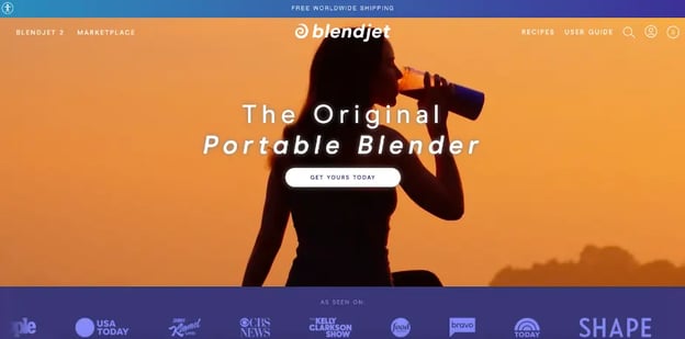
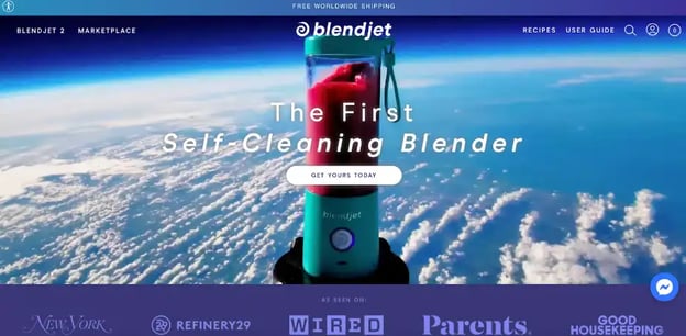
- Example: Blendjet
Here is an example from Blendjet using different value propositions in the headline:
2- Have clear objectives and goals
Set precise goals for your eCommerce landing page, such as increasing sales, generating leads, or increasing interaction. Ensure that these goals are both obvious and measurable. Is it collecting emails? Is it for a single conversion? Is it to collect leads?
Here are some examples:
- Complete a form
- Complete a survey
- the address of your email
- Save a coupon
- Get a free trial here
- Get a free ebook download
Here is an example from LIV Watches, a landing page with a specific goal and call to action:
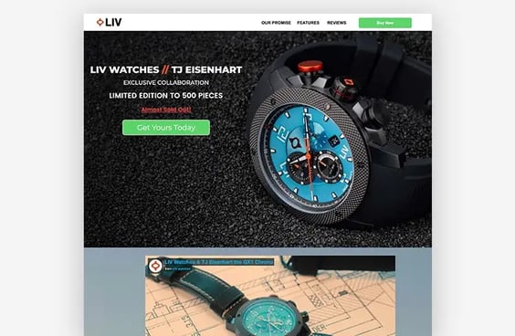 Image source: unbounce.com
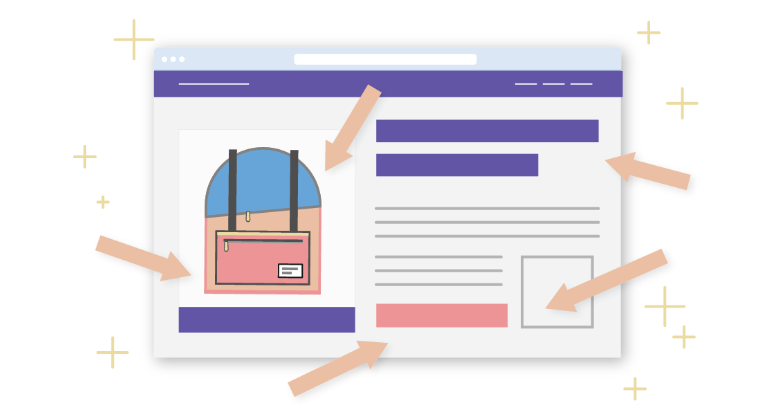
3- Optimize your layout, design, and images:
Avoid going overboard while building your landing page. Your design should be concise and easy to understand. Keep your copy brief and uncomplicated, and make good use of white space. Use high-quality photographs that highlight your product or service to optimize your images, and use alt tags to increase accessibility and SEO.
As there shouldn't be any confusion when visitors transition from your landing page to your main website, you also want to make sure that all of the items on your landing page are consistent with your brand; design, font, logo, images, or even videos. Keep it simple yet professional. Keep it clear, yet high quality.
Here is a nice example from Alexa Peterson with a great, simple, and compelling design with a high-quality picture:

4- Use clear, personalized calls-to-action
Your landing page's sole objective is to encourage visitors to click the call-to-action button. Your CTA should be visible above the fold and stand out from the rest of the page visually. Additionally, you should almost always use just one CTA.
Use calls-to-action that are obvious and prominent to entice visitors to take action, like "Buy Now" or "Request a Quote."
Additionally, you should personalize your call-to-action to increase conversion rates by using information about your website visitors and giving them exactly what they want and need.
Check the CTA of Adidas here, “Reserve now” , “Learn more”:
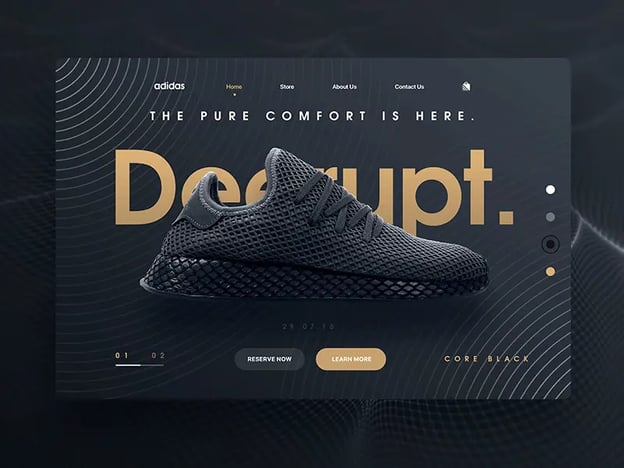 Image source: uplabs.com
5- Have a responsive design!
Adapt your website to mobile devices. It's crucial to design mobile-friendly landing pages as more and more people use mobile devices to surf the internet. Use landing page optimization tools to check whether the content on your landing page is readable and appealing on mobile.
Here is an example from Mahabis mobile landing page:

6- Use Social Proof
Establishing your brand's credibility is crucial if you want to turn prospective clients into paying ones. And one important method to do this is by including social proof on your landing pages.
Customer testimonials, ratings, and reviews are a few of the common means of demonstrating social proof.
Did you know 93% of millennials place more trust in online reviews than in recommendations from friends and family? Reviews are more dependable than advertisements, according to 83% of consumers.
Here is a great example of social proof from Casper Mattresses:
.webp?width=630&height=383&name=CASPER%20(1).webp) Image source: mailerlite.com
Image source: mailerlite.com
7- Make sure there is no loading time on your landing page
Simplify your navigation so that visitors may quickly and easily find what they're looking for on your landing page.
Visitors anticipate a rapid load time when they land on your landing page. According to studies, you just have three seconds to make an impression on your visitors. By optimizing your landing page's pictures, videos, and general layout, you may reduce load time. Making your landing page load as soon as possible is made possible by many landing page optimization solutions.
Avoid this view; this can be a turn-off for your clients:
 Image source: Instapage.com
8- Establish a sense of urgency to heighten FOMO
Utilizing limited-time incentives to instill a sense of urgency is a tried-and-true way to increase conversion rates. The FOMO (fear of missing out) impact will be felt by your potential clients if a bargain you're offering is only going to be available for a short period of time, like a few days or even 15 minutes. They are compelled to buy now rather than later as a result.
Check out this example of Obvi using a sense of urgency during Black Friday:
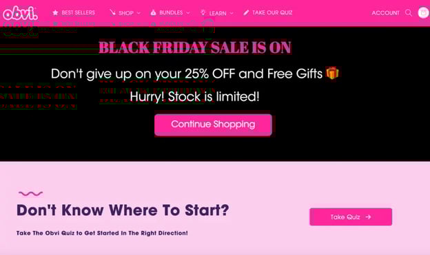 Image source: optimonk.com
9- Optimize your landing page forms
Create brief, straightforward forms with only the fields that are absolutely necessary. Use validation to guard against mistakes. To do this, only ask just for the information you NEED to have. To reduce typing, use radio buttons; people are lazy, and they don’t want to type. Make it super obvious by using directional cues. Moreover, let the landing page be mobile-friendly.
Check what chipotle did on its landing page:
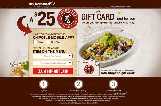 Image source: wordstream.com
10- Use analytics!
Monitor and evaluate the effectiveness of your landing page.
Not least, it's critical to monitor and assess the effectiveness of your landing pages. Each landing page's total conversion rate is important, but you also need to consider how well it converts for certain user groups. For one subset of your target market, a landing page might perform exceptionally well, but terribly for another.
Utilizing analytics enables you to continue to optimize your landing pages in the future while making data-driven decisions.
Monitoring and analyzing your stats can help you find areas for improvement and come to informed judgments about the performance of your landing page.
Here is an example of the analytics of an eCommerce landing page:
Let Convertedin do the work!
Converted.in is a marketing operating system for e-commerce, which utilizes data and shoppers' insights to create personalized multi-channel marketing that boosts customer engagement and maximizes ROI.
It will help you target the right customers, engage shoppers, and save time with ready-made automation templates.
Boost sales and entice shoppers with personalized ads across multiple channels using our e-commerce-focused automation platform.