By
By
As an owner of an e-commerce store or someone who works at one, your end goal is to ensure your website visitors convert and purchase your products or subscribe to your services, right? However, you need to understand that you’re working on guiding your customers toward conversion and not forcing them to do it.
That is a general rule you must apply to all aspects of your e-commerce business. This article will focus on one particular aspect: the call to action (CTA). We will walk you through how to create the best CTA for your online shop — one that can optimize your conversion rate and simultaneously deliver the ultimate solutions to your customers’ problems.
Before delving into the best practices for creating a CTA, let’s quickly go over what a CTA is and why it is crucial to invest in it.
Are you aware of how short the attention span of a user is? Did you know that it’s only 8 seconds? EIGHT SECONDS !! That’s how long you have before you lose the chance to turn a prospect into an actual customer.
How could that be related to our topic about CTA?
The answer is pretty simple. Your customers don’t have much time to waste on being lost inside your online store. If you don’t guide them and walk them through each step of the conversion funnel, something else will catch their attention, and you’ll lose them. What do you do then? Your CTAs are your answer to that.
Call-to-actions, or CTAs for short, are clickable buttons that guide users, prospects, or repeat customers and direct them to your e-commerce store or through it to take a particular action. This action does not necessarily have to be buying; it may be a step preceding that, such as registering, creating an account, downloading a demo, or subscribing to a newsletter.
“Buy Now,” “Shop Now,” “Learn More,” “Click Here,” “Swipe Up.” These are some examples of what a call to action can look like.
If you want to learn how to create the best Call-To-Action for your e-commerce store, “Click Here.” Okay, we’re just kidding. That’s not a real CTA haha. Just keep reading to learn how to create a real one!
Top 10 E-Commerce Call-To-Action Best Practices
- Create A Sense of Urgency and Scarcity.
- Use Appropriate CTA Language and Copy.
- Spend Time Thinking about the Design of your CTAs.
- Ensure CTA Optimization for Mobile Commerce.
- Think about the Placement of your CTA.
- Surround your CTA with Key Messages.
- Provoke Emotions and Give Them a Reason to Act.
- Always Think of your Target Audience and Personalize Whenever Possible.
- Remember that CTAs are not only on your Website.
- Evaluate your CTAs with A/B Testing.
There is no magic formula for creating the best call to action; instead, you need to figure out what works best for your e-commerce store while considering crucial aspects of the business, such as your target audience and business goals. The following points will pave the way for you to create better CTAs for your online store.
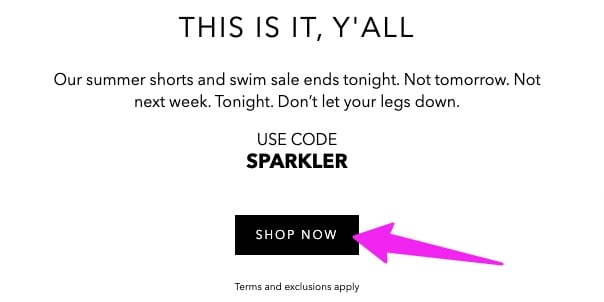
1- Create A Sense of Urgency and Scarcity
As mentioned earlier, the main aim of a call to action is to guide customers to take a particular action. One of the best ways to persuade a human being to take action is by making them feel that they’ll miss out on something if they don’t. That technique is called FOMO Marketing, which stands for “Fear Of Missing Out” marketing. FOMO has three main psychological aspects: Urgency, Scarcity, and Social Proof.
Can you apply this to a call to action?
Of course, you can. All you have to do is create a sense of urgency and scarcity. In other words, make your customers feel that if they don’t act now, someone else might be getting the offer, or the products might run out. These time-sensitive messages are usually very compelling and push people to click the CTA button to not miss out on something good.
For instance: Change your “Shop,” or “Shop Here” CTA into “Shop Today,” or “Shop Now—Only on sale until midnight.”
In one of the following points, we will discuss in more detail how to surround your CTA with key messages. Among these messages, there could be elements supporting the FOMO effect, such as announcements regarding limited-time offers, temporary deals or discounts, or updates on remaining stock availability.
Example: BONOBOS
2- Use Appropriate CTA Language and Copy
Think of how much time marketers spend thinking about their ad copy. That is not because they have excess time to waste but because they know that ad copy is crucial for conversion.
Similarly, the language or words and phrases you write on a call-to-action button play a role in encouraging the user to take action. The secret here is to learn how to combine between simplicity and creativity. In other words, you want the language or the copy of your CTA to be clear and simple but different and creative at the same time. All while ensuring that it is benefit-oriented and reflects value.
Difficult mix? Yes, indeed. However, it is worth it!
Additional Tips:
- The copy on the call to action button should accurately reflect the action. In other words, you can’t write “Shop Now” on a CTA button if clicking it directs customers to a landing page for registration. If you want to collect customer data, then use a CTA that says, for example, “Register Here.”
- Do not use any manipulative or deceiving language, and make sure you deliver on the promises you make.
- If your call to action needs more explanation you can’t fit on the button, write this information in a smaller font below the button to ensure your prospects or customers understand what will happen when they click the CTA.
- Make sure your language is welcoming and friendly and not at all pushy.
- Avoid “Confirm Shaming.” Don’t know what confirm shaming is? Well, it is using language that makes users feel guilty about not taking a particular action. Examples of CTAs with confirm shaming language include: “No, I don’t like deals,” or “Nope, I don’t want free stuff.”
Example: Shop The Budgetnista

In this example, you can see a creative copy on the call to action button where the store created something different than the usually used CTAs. The language is also clear and simple. However, what we like most about this example is that they did not assume that everyone would automatically understand their creativity. Their CTA says, “Get My Goodies,” but they did not assume that people know what a “Goodie” is, so they included a few sentences above the call to action button explaining what it is.
3- Spend Time Thinking about the Design of your CTAs.
The design of the call to action button is as important as the language and the copy. Do not underestimate things like the Font, Size, Colors, and shape of the CTA button. These are elements that play a crucial role in catching the attention of the prospect or the customer.
- Color: The color of your CTA button is one of the most significant design choices you’ll make. It must be visually attractive to stand out from other elements on the page. Is there a magic color for CTAs? Well, no, there is not. You can choose the colors you desire while ensuring that they match the overall design of your website and that they appeal to your target audience. Also, contrast is important.
- Size: The size of your CTA button should be proportional to other elements of your website’s design. Pick a size that makes other elements and the overall page layout look balanced.
- Shape: Use whatever shape you would like. You can go for the most commonly used rectangular box or try other shapes. Nevertheless, the most critical element here is to ensure that, regardless of the shape you use, your CTA button appears clickable.
Example: BEASTMODE vs. Dep. of Motivation
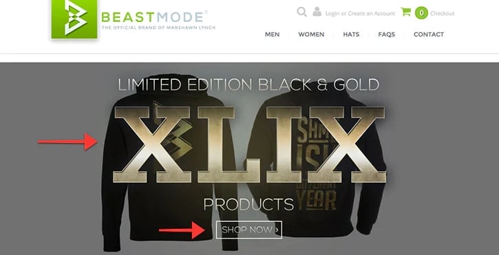

In our opinion, when it comes to the design, the call to action in the second example was better than in the first one. Our opinion is based on all the elements we explained earlier. For instance, in the second example, the CTA "learn more" has a clearer design with a color that goes perfectly with the website page's background, unlike the CTA in the first example, "Shop Now," which is placed within a transparent rectangular box with colors nearly identical to the background, reducing its chance to stand out in the website page.
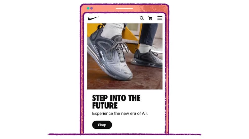
4- Ensure CTA Optimization for Mobile Commerce
Mobile commerce is not new; however, its significance is increasing daily. It is crucial to remember that the mobile commerce market share comprises 73% of total e-commerce (Zippia, 2022). Therefore, e-commerce stores should prioritize optimizing everything related to their business to mobile devices.
This practice goes hand in hand with the previous one because considering the design of the CTA button, including the color, size, and shape, is part of optimizing it for different devices.
There is an abundance of examples of brands that ensure their CTAs are optimized for mobile devices. One example is Nike.
5- Think about the Placement of your CTA
The placement of your call to action on the website page is another crucial element you should always consider. In other words, you cannot randomly place your CTA anywhere and expect it to lead to conversions.
The most common advice regarding this point is to place your call to action above the fold. What does that mean?
“Above the fold” simply refers to the part of a web page shown before scrolling. Any content you'd need to scroll down to see would be considered 'below the fold'. So, the 'fold' is where the browser window ends, but the content continues underneath.
So, when it comes to the placement of your call to action, the best practice is to place it as part of the content on the part of the website page shown before scrolling. Don’t make your customer scroll through the entire page to reach the CTA.
Example: Addidas
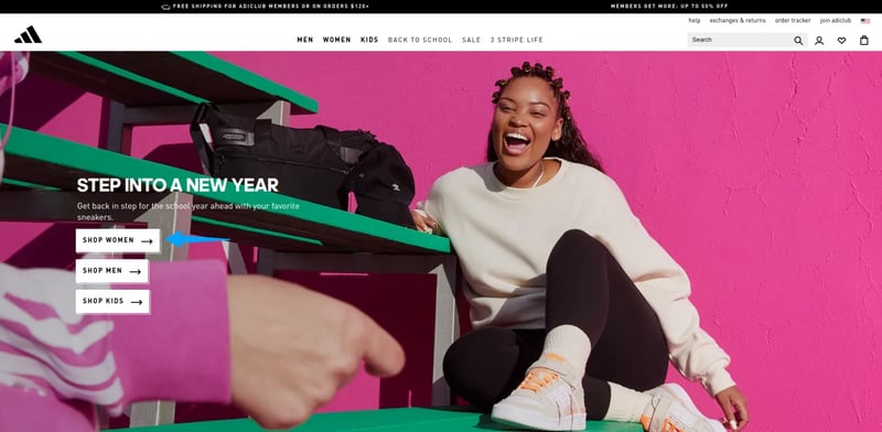
Notice how the CTA is placed on a display banner above the fold. Such a practice would grab visitors’ attention and encourage them to take action right away without being exposed to friction or distractions. We can also see that there are three different CTAs to guide different categories of customers.
6- Surround your CTA with Key Messages
What’s surrounding your call to action is almost as important as the call to action button itself, if not more.
Your call to action can be surrounded by several key messages and various elements to increase the likelihood of visitors clicking on it and taking action. This can include:
- Customer testimonials are the perfect element to provide the social proof your website visitors need.
- Delivery Policy and Return & Exchange Policy (if it’s a CTA on a product page or checkout page).
- Payment Options (if it’s a CTA on the checkout page)
- Size Guides (if it’s a CTA on a product page).
- Urgency Elements (such as countdown timers and limited-time offers).
- Scarcity Elements (such as the number of items left in stock).
- Discounts, Promotions, or special deals.
Example: Kiehl’s
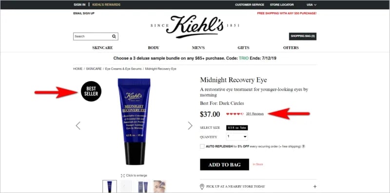
That is a good example of what we are discussing at this point. As you can see, the call to action “ADD TO BAG,” although simple, is surrounded by many supporting elements. For instance, the website labels the product as “Best Seller,” and mentions the number of reviews the product has, which provides social proof.
7- Provoke Emotions and Give Them a Reason to Act
At the end of the day, customers are human beings driven by emotions. Therefore, if you provoke emotions with your call to action, chances are your customers are most likely to click on it and take action. Needless to say, we’re talking about positive emotions here, such as excitement and enthusiasm.
To do that, you can add many things to your call to action, such as:
- Numbers: “Buy now and get 20% off!”
- Adjectives: “Start the magical experience!”
- Promises: “Lose weight in just 10 weeks!” or “Grow your hair in one month!”- However, you need to live up to that promise not to lose the transparency of your e-commerce brand.
- Tell a story: “Join the Adventure!”
- Social Proof: “Join other happy customers!”
Example: BOMBAS
%20Example.webp?width=700&height=334&name=Bombas%20Call%20to%20Action%20(CTA)%20Example.webp)
We love this example because the call to action “Get My 20% Off” has a couple of the elements we just mentioned. First, it includes a number (a discount) that can provoke the emotion of excitement. Also, the pronoun “My” makes the customer feel that other people have already had this discount, which provokes fear of missing out on something good that others might have enjoyed.
8- Always Think of your Target Audience and Personalize Whenever Possible
You can apply all the best practices in the world and still get no positive results if you do not consider your target audience. We are not presenting all these tips and tricks for you to apply them blindly; instead, we want you to only apply what you know will appeal to your target audience.
To do that, you need to perform accurate customer segmentation, have a well-identified target audience, and understand all the different segments within that audience.
The next step after that is to personalize. Personalization is the key to your customer’s heart. A customer wants to see that you know them and care about them. Therefore, it goes without saying that personalizing your CTAs will result in more conversions. You can simply start by including customers’ names in your CTAs. This will catch their attention as well as make them feel special.
You can also use pronouns just like we mentioned before, such as “Get Your Offer Now!” Pronouns give the impression that you are addressing your customers as if you know them personally.
Studies show that personalized call-to-actions perform 202% better than basic CTAs (Hubspot, 2023).
Example: PACK’D
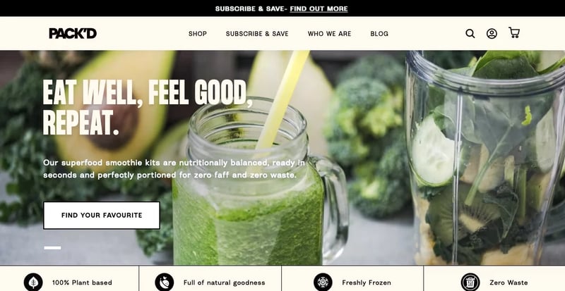
You can opt for anything of what we mentioned, or you can do like what PACK’D is doing in this example. The CTA “Find Your Favourite” does not just include a pronoun but also gives your customers the impression that you know what their preferences are.
9- Remember That CTAs are not only on your Website
Sometimes in the middle of the discussion about CTAs, we can forget that they can also exist outside of your e-commerce website. For example, your social media ads and your email marketing campaigns include CTAs. So, make sure to remember all these practices while creating these CTAs as well.
Example: MADE.COM

Social Media Ad CTA: “Design Your Happy Place”
Example: DE BEERS Jewellery
Email Marketing CTA: “Discover Your Bridal Style”

10- Evaluate your CTAs with A/B Testing
A/B testing is not just important for CTAs. In fact, it is one of the most crucial techniques to ensure the overall success of your e-commerce business. Without continuous monitoring and evaluation, you will never know whether you’re on the right track.
We would also like to say that we put this practice as the last one on purpose. In other words, we want you to know that no matter how successful all the previously tackled techniques are, you still need to evaluate them in the context of your e-commerce business. A/B testing is your way to doing that.
Final Words:
To sum up, although challenging, mastering the art of creating an attractive call-to-action (CTA) is crucial for e-commerce businesses. Therefore, to make it easier for yourself, make sure you follow the best practices we discussed and always keep an eye on what other brands are doing to get inspired.
Before we leave you today, we want to give you one more thing. Converted.in is offering you today a marketing automation tool that can do the following for you:
- Create, personalize, and automate all your email marketing campaigns (including CTAs).
- Launch and automate any social media ads (which will also include CTAs as we’ve mentioned in the article).
- Gather all the customer data that you will collect on Cyber Monday in one place with a 360-degree view, which you will need to customize CTAs for your target audience.
“Book your demo now!” … Now, that is a CTA!