By
By
You can have the best products, the greatest marketing plan and simply be doing everything right, yet your sales are not reflecting all that; why? Simply because you are not asking people to make a purchase.
A call-to-action (CTA) is a crucial part of any marketing activity you are conducting. But for today, let’s zoom in on your email marketing efforts.
The email CTA for eCommerce businesses is as important as salt is to a meal. In other words, without a CTA, your emails will be bland and ineffective.
To help you write CTAs that convert, in this blog, we will present you with everything you need to know about email CTA for eCommerce businesses.
Table of Contents
- What is a call to action (CTA) in an email?
- How to write the best email CTA for eCommerce
- Top practices to use CTAs effectively in your email marketing
- 10 best email CTA examples
What is a Call to Action (CTA) in an Email?
A CTA is a button or a phrase that encourages customers to take a desired action. These actions can be making a purchase, visiting a website, downloading an app, or subscribing to a newsletter.
Needless to say, there are hundreds of other actions you can nudge customers to take. But to keep it short and to the point, a CTA helps you guide customers to do something specific.
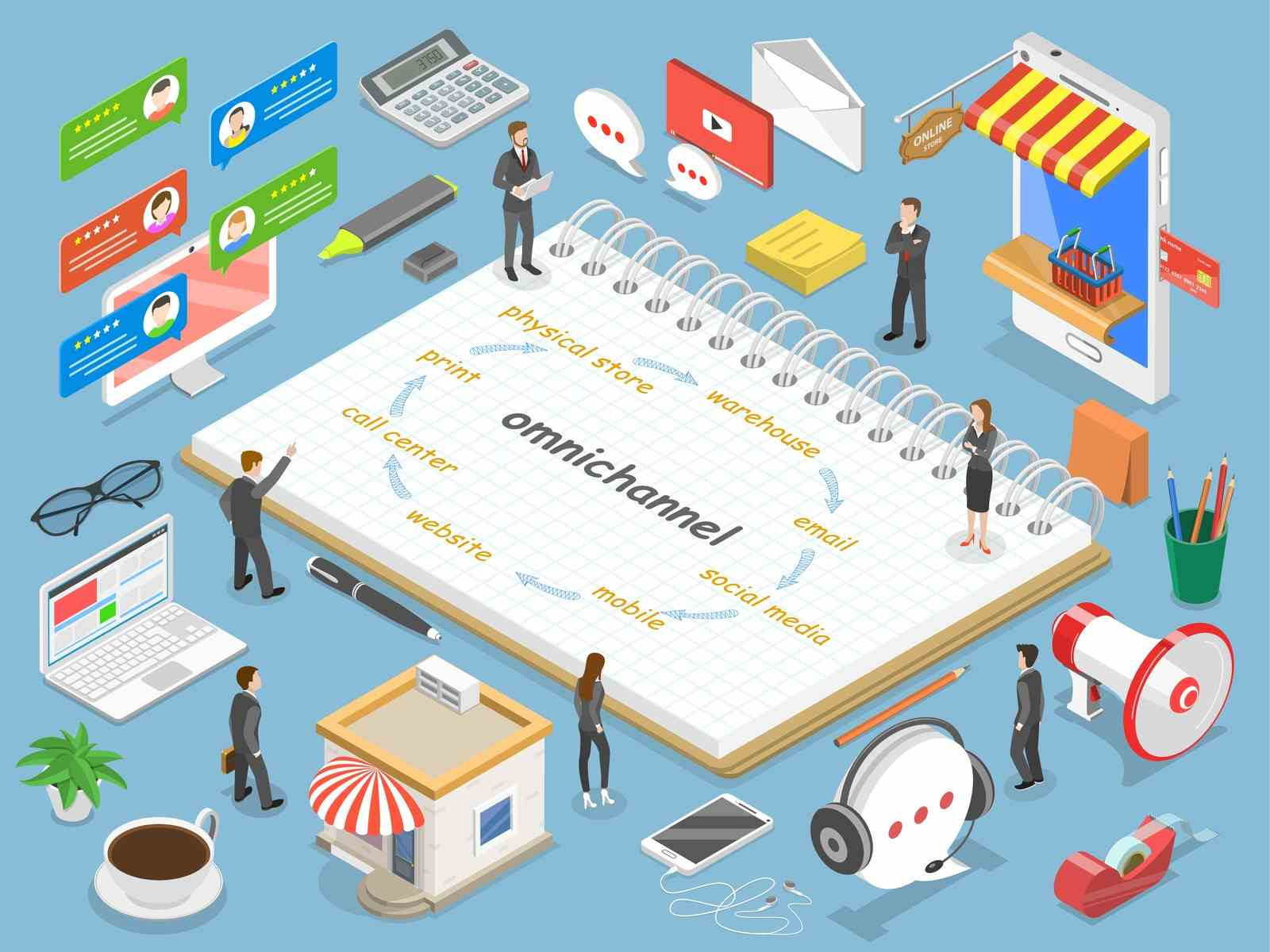
Creating the right CTA stems from knowing where your customer, or potential customer, is in the marketing funnel. That’s a bit vague, isn’t it? Let’s take a deep dive into how to write the best email CTA for eCommerce marketing.
How to Write The Best Email CTA for eCommerce?
 Image source: emailonacid
As previously noted, learning where the recipient is in the marketing funnel is the first and most crucial part of writing the best email CTA for eCommerce.
By considering the funnel stage, you can create CTAs tailored to their path. For instance, if the email recipient is in the awareness stage (top of the funnel), then your CTA can’t be ‘Buy Now!’ as they are not ready yet for that action. Instead, it can be ‘visit our website to learn more’, ‘Follow us’, or ‘ stay connected’.
On the other hand, if the recipient is in the decision phase (bottom of the funnel) then your CTA can be ‘Buy Now’ or any other one that encourages a purchase.
In addition to considering the stage of the funnel, you can create the best email CTA for eCommerce by:
- Creating urgency by adding psychological triggers to the CTA like limited-time offers. For instance, instead of your button saying ‘Shop now’, it should say ‘Shop before the 30th and get a 10% discount’. In fact, this creating urgency can increase sales by a whopping 322%!
- Highlighting the email topic through the CTA. If it's a cart abandonment email, then using something like ‘Buy Now’ will be relevant but ‘Finish Your Order’ or ‘Continue To Checkout’ will be more effective.
- Focusing on value, not on the action. For example, if you have a loyalty program, then your CTA can be ‘Order now & save 50% on your next order’.
- Optimizing for different devices. Businesses have been focusing too much on mobile devices these days that they forget other devices exist. Yes, it's a no-brainer that your CTA button should be optimized for mobile phones. But it also has to be optimized for all other devices.
Top Practices to Use CTAs Effectively in Your Email Marketing
There is no guarantee that customers will actually click on your CTA and take the desired action, but with the following practices, you can drastically increase your chances!
1- Focus on CTA design and location
One of the most important practices to ensure you are putting out the most effective CTAs is the button itself. Your brand identity should pop in the design, but you also have to consider the psychology behind the colors you choose.
Another key factor is the location of the CTA. For years, marketers only placed it at the end of the content. However, many studies now show that adding a CTA in the middle can be as effective.
Unfortunately, there is no cheat sheet for the design and location of your button, you have to test till you find the ones that work best for your eCommerce business.
2- Less is more
When it comes to CTAs less is more. Which basically means you should write the least amount of words you can. If you can deliver your message with one or two words, then surely do that!
This concept is also applicable to the number of CTAs in your email. Ideally, you only have 1 CTA per email so your recipients don’t get confused. But if you really have to, then 2 CTAs can also work.
3- Stand out with your USP
Each eCommerce brand has its own identity that makes it stand out, so adding a touch of your own will help personalize the whole experience. This is also a great way to highlight any cause you stand behind.
For instance, if you are known for your efforts in recycling, your CTA can be ‘Shop Now & Save Mother Earth’.
4- Use first-person POV
The first-person narrative also helps in personalizing your customers’ experience. This can be easily done through the wording of your CTA.
How? Simply by adding ‘My’! So instead of saying ‘Add To Cart’ you should say ‘Add To My Cart’.
5- Constantly test and improve
There is no science to creating the best email CTA for eCommerce businesses; that’s why it's essential to constantly test and improve the way you write and place your CTAs.
Now that you know everything about creating the most compelling email CTA for eCommerce, let’s take a look at some of the best examples to inspire your own.
10 Best Email CTAs Examples
These 10 brands are doing something right with their CTAs; ready to dive in?
1- Molekule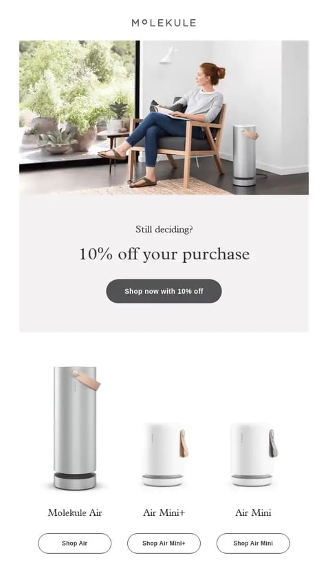 Image source: omnisend.com
This is a perfect example of simple emails being the most effective. As a business that sells air purifiers, Molekule is all about serenity and simplicity, this is clearly seen in their email which just focuses on the discount and showcasing the products.
2- Magin Spoon Cereal
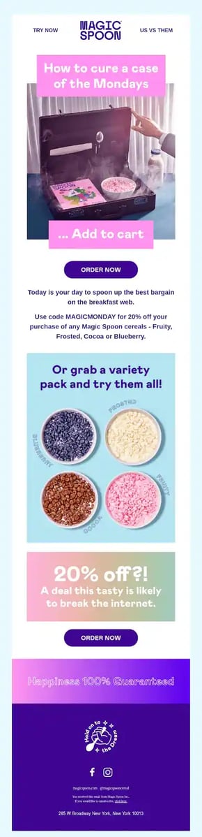
Using an eye-catching yet simple design, Magic Spoon Cereal catch’s the attention of the reader. This is accompanied by two clear and strong CTAs are the recipe for a successful email marketing campaign.
3- Shopify
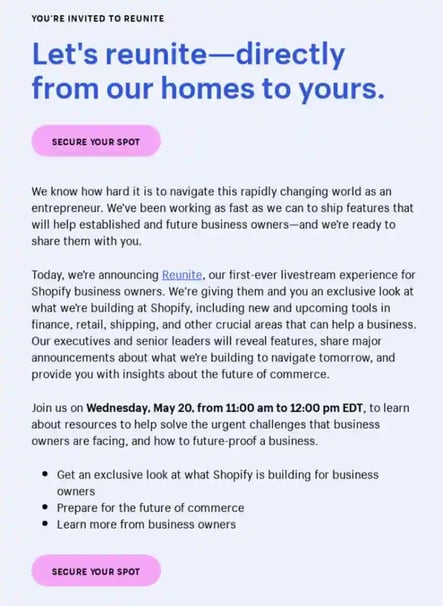
Shopify knew its email content was a bit bulky, and not everyone might make it all the way to the end where the CTA is. That’s why the email has an additional CTA button right off the bat with an enticing word that will get people to actually read.
4- Camelcamelcamel
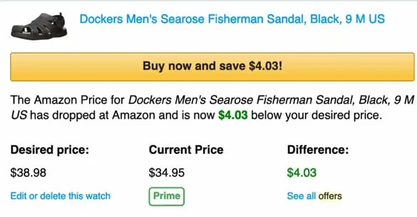
The Amazon price tracker, Camelcamelcamel, focuses here on creating a sense of urgency by using the familiar Amazon CTA button design but with a personalized twist.
By focusing on the money recipients will get to save and leveraging FOMO, the email will encourage everyone to act quickly.
5- Clive Coffee
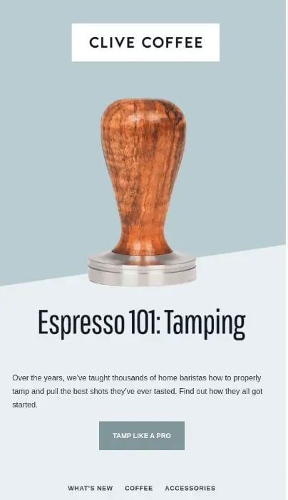
Another great example of personalizing the CTA can be found in Clive Coffee’s email. This can be considered a call-to-value (CTV) more than a CTA, as it solely focuses on what the recipient will get after clicking that button.
6- Bailey Nelson 
In the following example, Bailey Nelson uses the email content to create a sense of familiarity with the reader. This familiarity is carried to the CTA, and with those encouraging words, their website visits must have doubled!
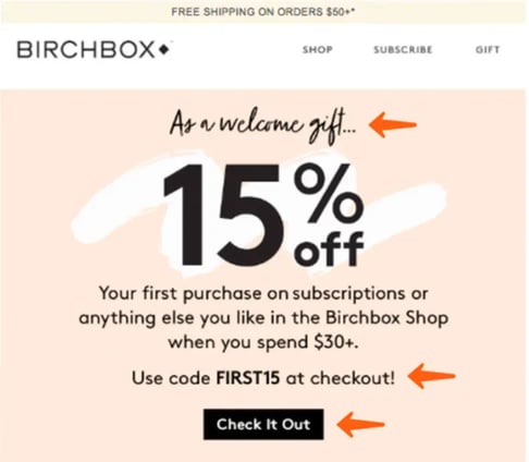
In this welcome email, Bircbox offers more than a warm welcome and happy greetings; the email also includes a discount code.
This offer being placed right before the CTA is a great marketing tactic that can drastically increase conversion.
8- Bobbi Brown Cosmetics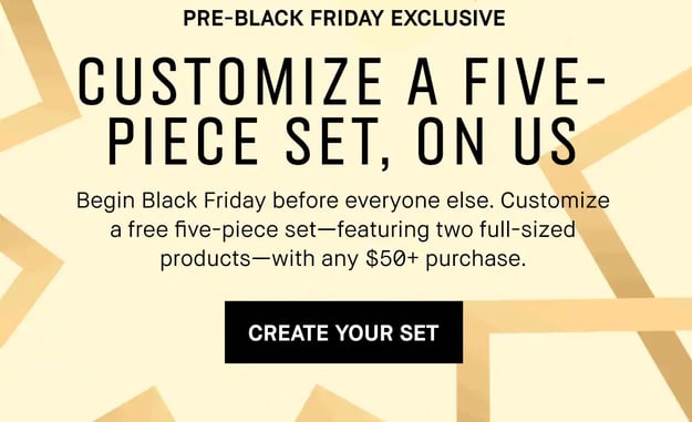 Image source: drip.com
The Bobbi Brown Cosmetics email offers a personalized touch to limited-time offers. This works on creating urgency while simultaneously intriguing customers to create their own set.
 Image source: sender.net
This CTA stands out with a pop of color and can be easily seen as the most prominent element in the email. It is also worth noting that the email is easy on the eye with positive usage of white space and carefully placed elements.
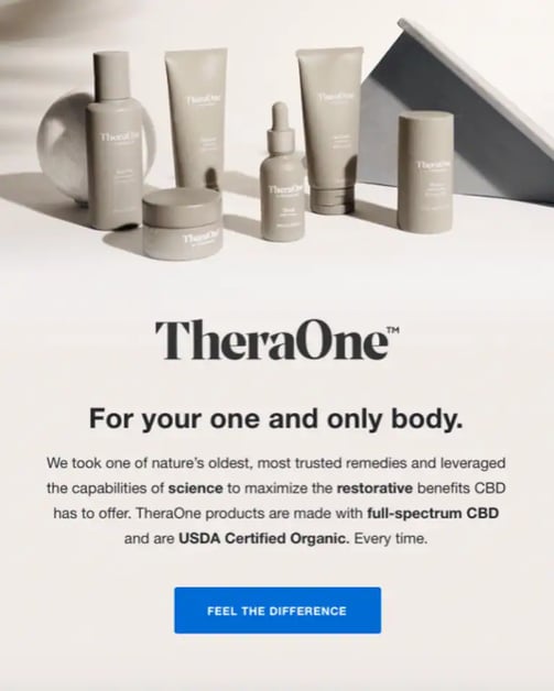 Image source: brevo.com
Another great CTA example is TheraOne’s email which promises a tangible result. Instead of using a generic ‘Shop Now’, the company decided to showcase what customers should expect from shopping for its products.